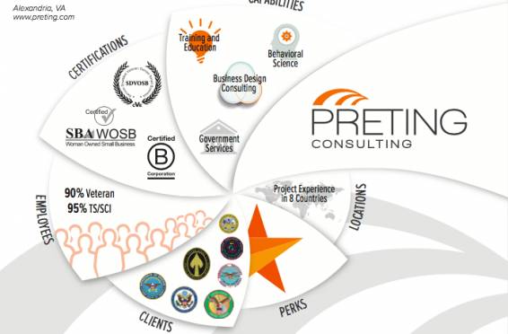
For the third year in a row we created an infographic to tell our story in pictures vice words. We’ve found this is a simple way to show our employees, clients, and partners what we do, how we do it, with whom we work, and where we go to support our customers’ missions.
The following shows the evolution of our 2018 infographic, including the final version. You can also download a PDF copy of our 2018 infographic here.
The Drafts
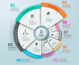
This year we opted for a more circular and landscape design. We presented the following template to our designer to show the “feel” we wanted and provided him with the content for each section.
Much of the work that goes into preparing the infographic is deciding how to show words in picture and figuring out the best way to present the data. Below is our first draft of the graphics in the template. We liked the overall look, but made edits to almost every single section of the graphic in later drafts.
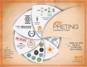
By changing the background color and giving some of the graphics a “lighter” feel, we got closer to what we wanted to present. We didn’t change the content in the next drafts, but focused more on colors, icons and placement.
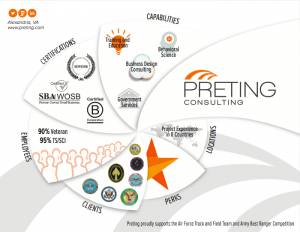
Final Infographic
This is our current 2018 infographic. You will see some subtle changes to the final graphics – shading, the size of the some of the icons, and slight adjustments to the graphics. Our hope for 2018 is that this graphic largely speaks for itself and that we can better communicate what Preting represents to our employees, clients, and partners.


